A journey to bring in better-qualified users and support the new yield strategy
In 2022, Disneyland Paris updated its sales strategy with yield management. The new journey had to handle the risks of dynamic pricing and encourage users to book early, as prices can change often.
Help users understand what they need so they book faster.
Encourage longer stays and visits to both parks.
Work within business, legal, product, content, and user constraints.
Understand how people book today
Secondary research
Together with the data analysis and A/B testing teams, we reviewed 30+ A/B tests and 2 funnel studies since 2020.
We also ran a heuristic audit to remove friction points and benchmarked other ticket sales journeys.
Primary research
We ran user interviews and checked our findings with the Consumer Marketing Insights team.
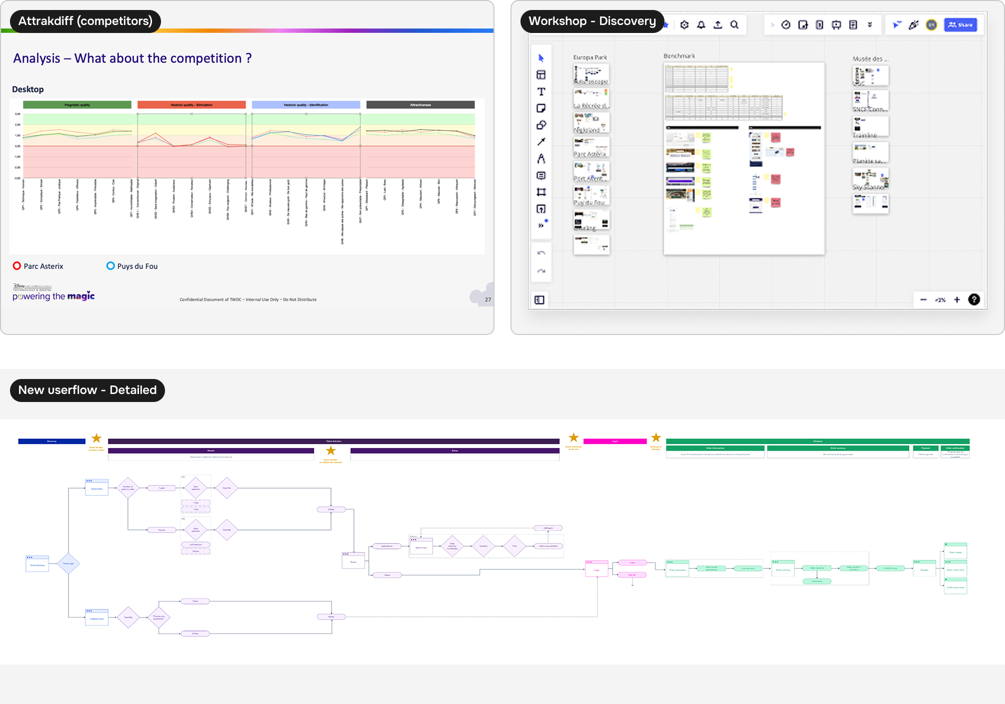
We also ran an AttrakDiff study on the booking funnel.
- Users see the funnel as too long.
- There seem to be too many products.
- Users are not well qualified when they enter the funnel. Half of them do not know Disneyland Paris has two parks. That was a key challenge for the redesign. With dynamic pricing, helping users understand the offer early was essential to protect perceived value.
Define the new sales approach
UX study presentation and collaborative workshops
We aimed to cut steps, reduce the number of products, qualify users better, and improve overall performance (SEO, data, and more).
Build a new ticket booking experience
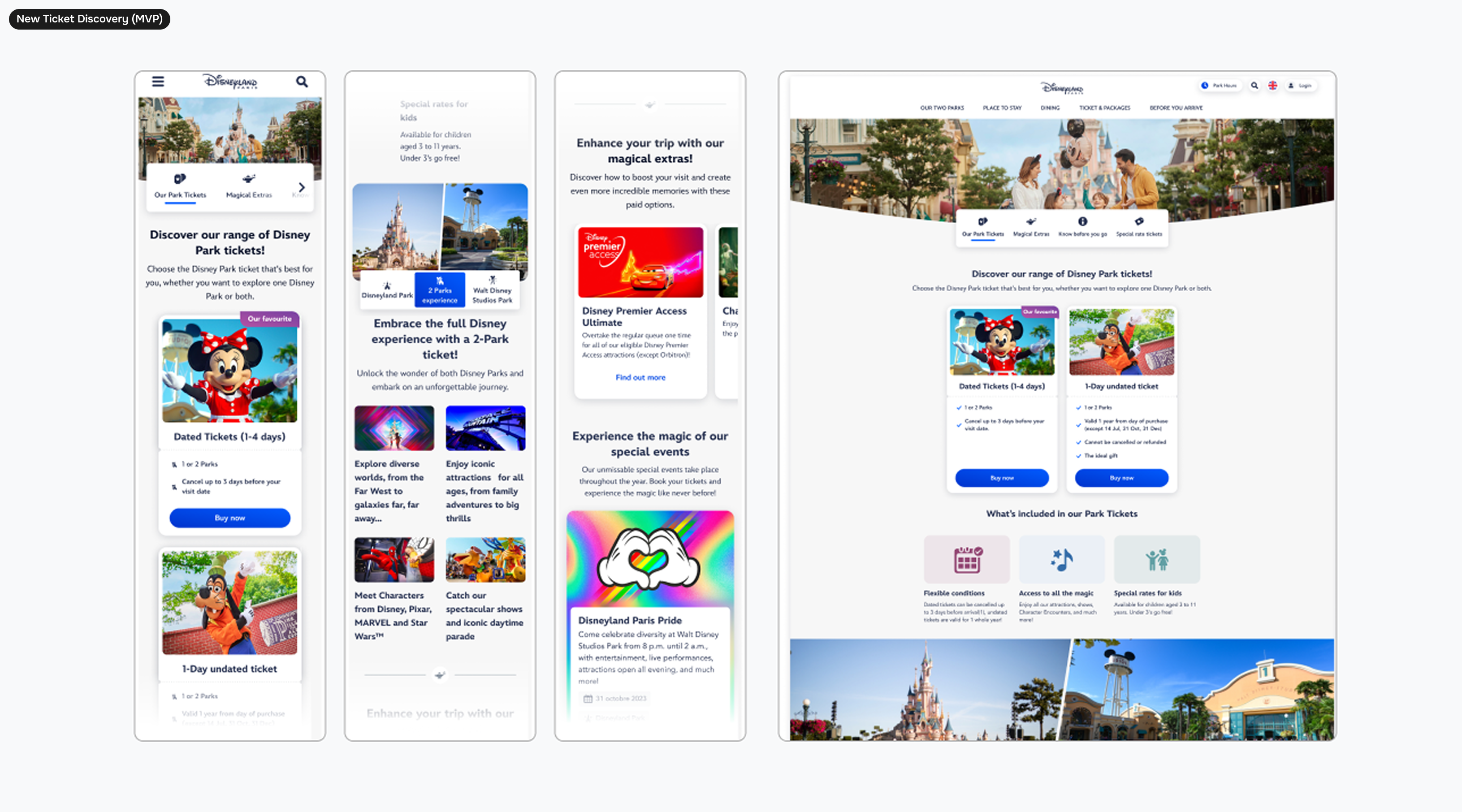
Ticket discovery
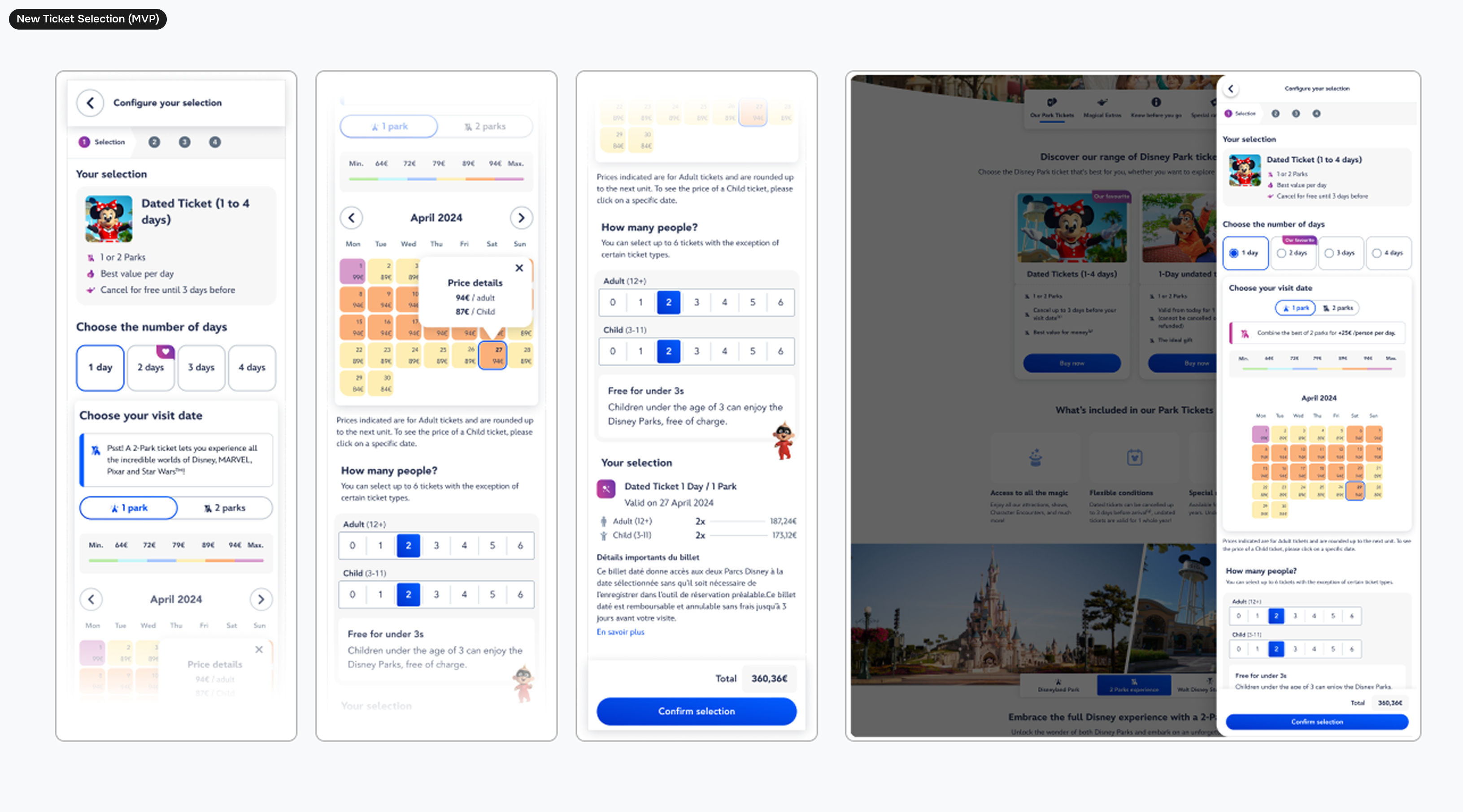
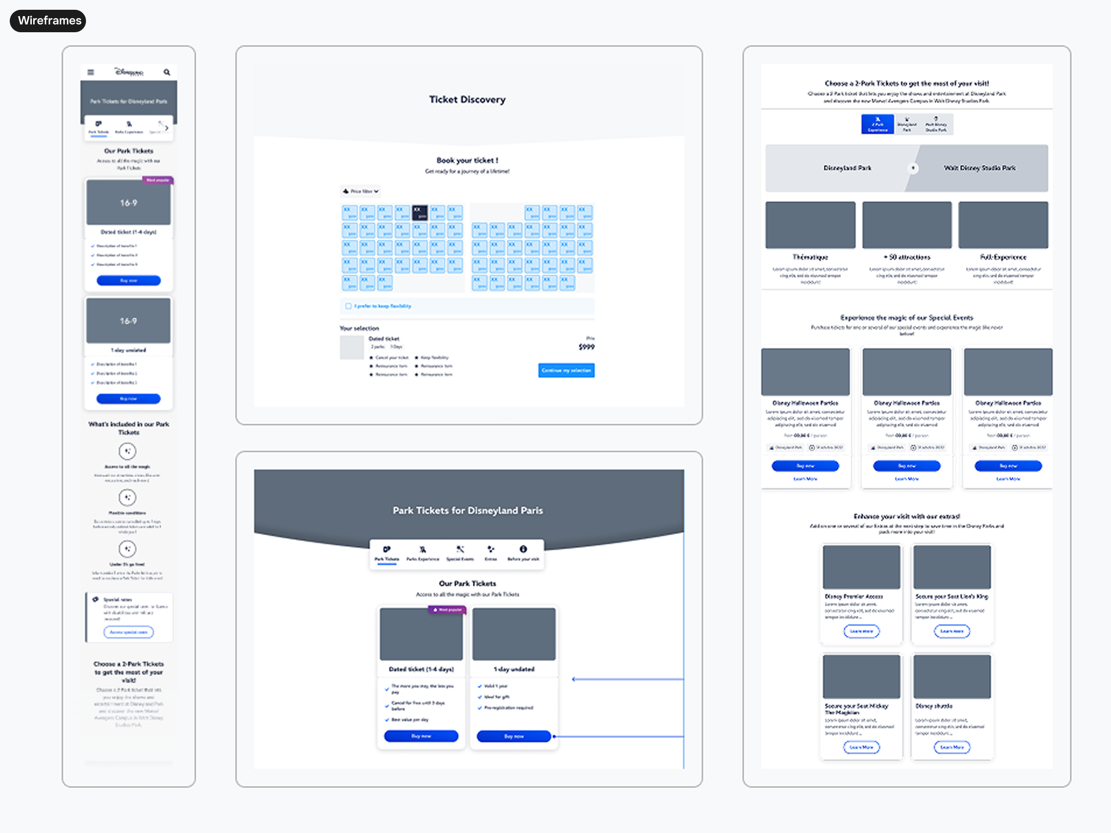
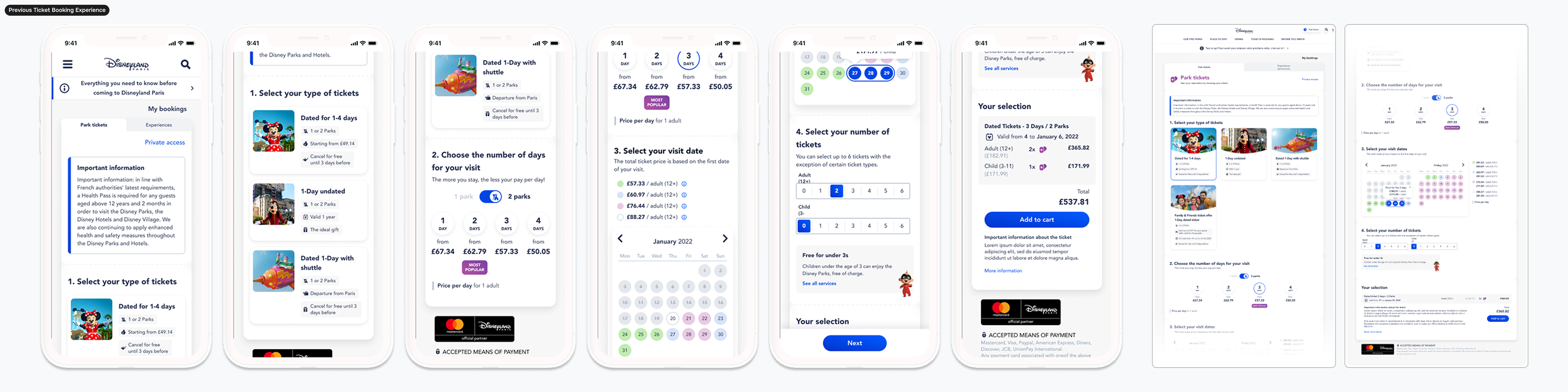
The first decision was to create a new entry point for ticket booking. Ticket selection used to sit in a separate funnel. It now lives on a discovery page that presents the two main ticket types: dated and undated. This helps qualify users and supports a stronger SEO approach.
Date selection
Dynamic pricing introduced a ticket price calendar. We explored different ways to support date selection and stay booking, while showing how much users save with multi-day tickets.
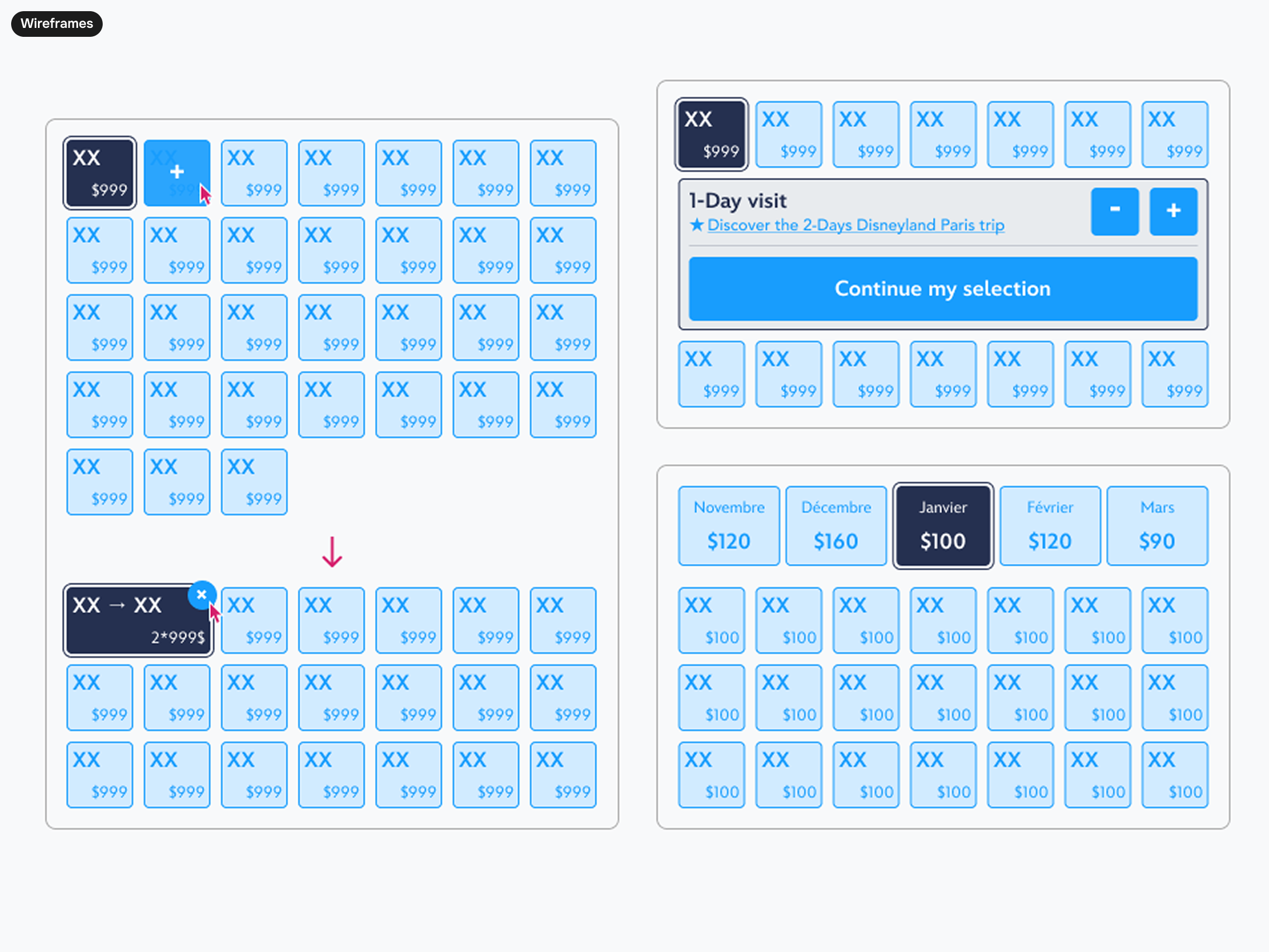
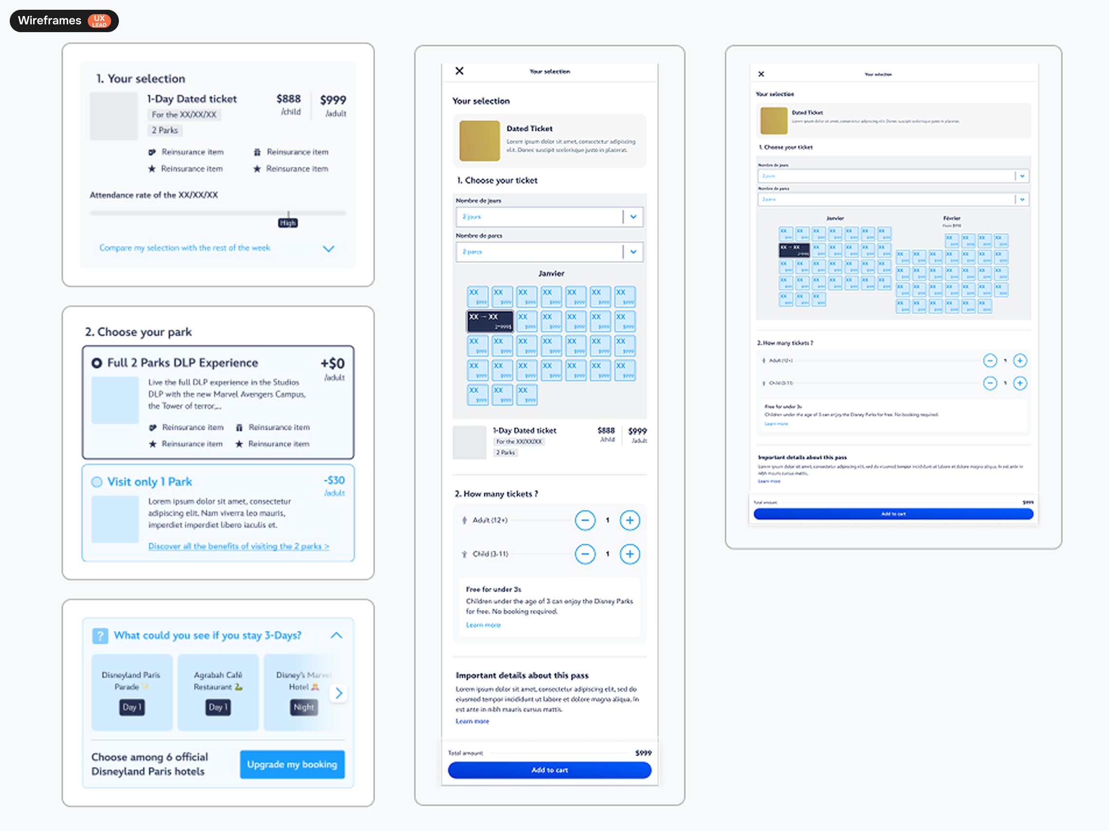
Ticket selection drawer
A drawer for ticket selection lets users get a quote quickly, while the discovery page still qualifies them. Over time, the drawer could also appear on marketing pages to offer tickets based on what users are reading.
400+ beta users helped us find the best ticket sales experience
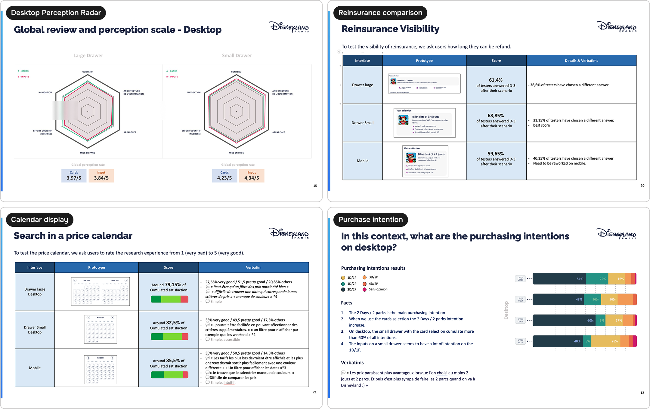
Quantitative A/B and B/A tests: inputs or cards? Small or large drawer?
We focused on ticket selection usability. We ran 6 comparative user tests (4 desktop, 2 mobile) to find the easiest way for users to set up their visit.
- The small drawer is easier to read and reduces cognitive load, because content is shown in a vertical layout only.
- Card-based selection worked better, and the nudge seemed to have a stronger effect.
Qualitative approach
10 testers tried the winning version from the quantitative tests in the full sales flow, from ticket discovery to payment.
A new journey and new booking habits for tickets
We shipped an MVP that met business needs and the new approach. We kept improving it based on booking data.
Key achievements
75% of users moved from ticket discovery to the ticket drawer, which improved user qualification.
Users changed their length of stay 1 to 2 times after we pre-selected 1 day.
The yield strategy was covered, and we managed the risks through UX.
And the rest of the ticket sales funnel?

The entire single-product sales flow
Multi-product sales were under 2%, so we removed the cart and let users book their visit date faster.
We added a price freeze with a countdown. I ran early research to measure frustration and stress.
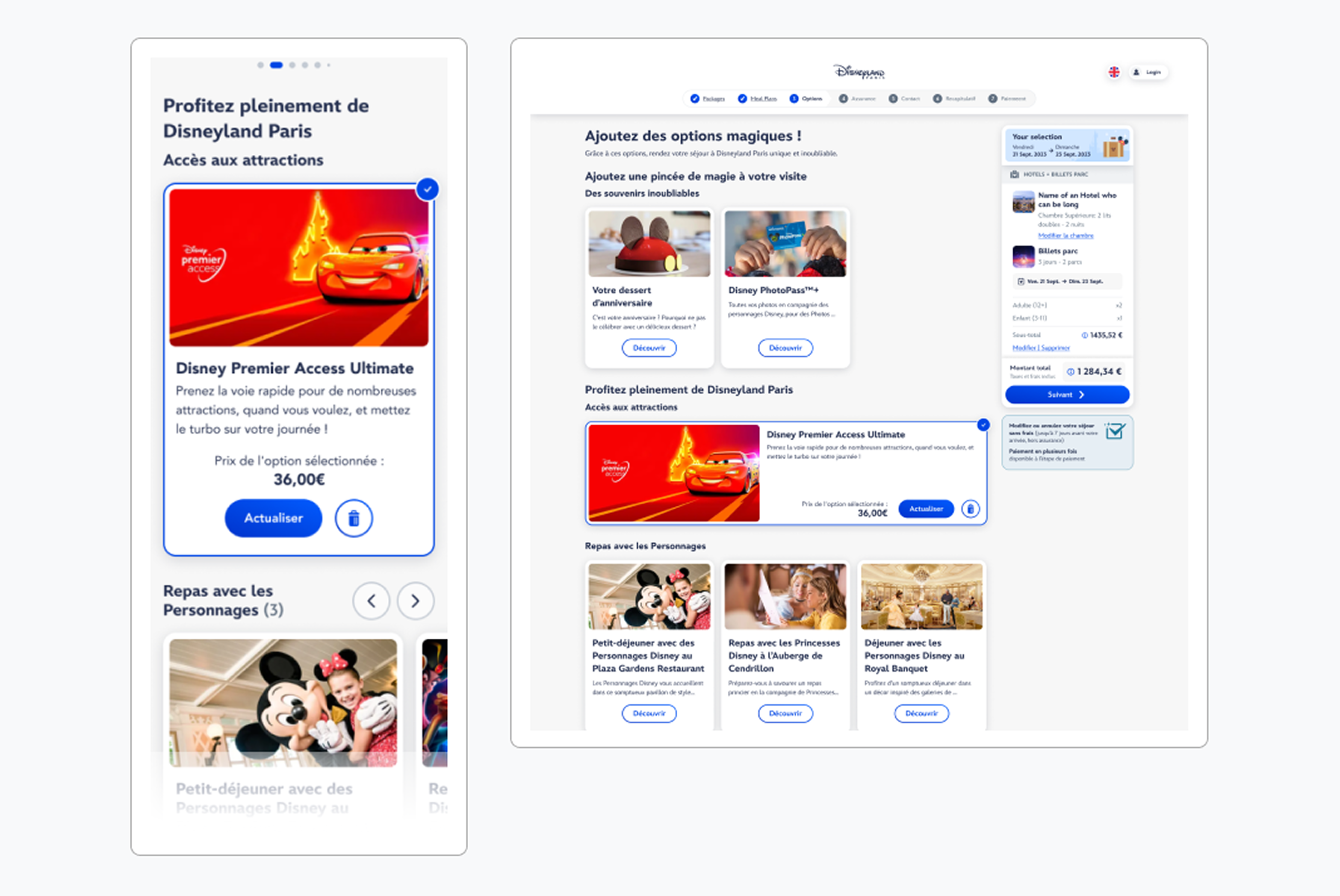
Optional add-ons selection
I led the revamp of the add-ons page (another UX designer ran the work), with the goal of increasing sales of Disney Premier Access and reserved seats for shows.
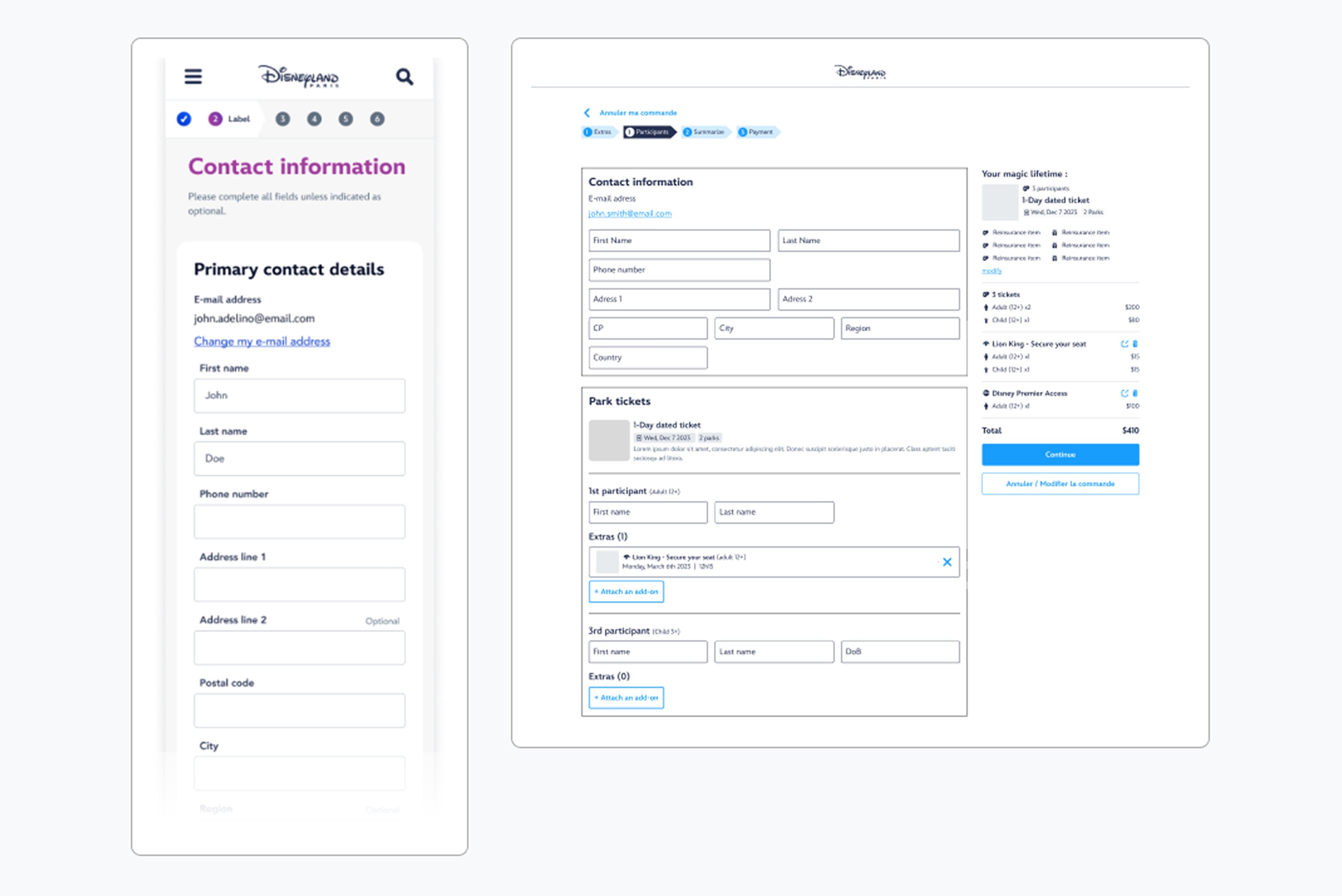
Participant page complexity
Within legal and technical limits, I redesigned the order detail page. The main challenge was letting users assign add-ons from this page, as required by the technical specs.
An experience that continues to evolve

UX monitoring: a score card based on UEQ-S and qualitative data
In July 2025, we launched a booking funnel study with pre- and post-booking surveys across devices and markets. It gave us an overall score and clear areas to improve for future digital projects.
A/B test in progress to improve the full funnel
We planned a long-term A/B testing strategy with the product and data teams
to measure the impact of changes and improve user qualification, usability, and how people see the sales journey.
Progressive disclosure
Pages held more information, so to reduce cognitive load we rolled out progressive disclosure and redesigned the information architecture of the booking journey.