A clear design opportunity!
Following a shift in the business model, with more special offers in the mix and a platform migration, the Hotel + Ticket Package funnel was rebuilt from the ground up.
My role:
I defined the design approach, led the research phases, and shaped the architecture of the new journey alongside a second UX designer and a UI designer.
The UX audit, AttrakDiff survey, and post-booking questionnaires all pointed to the same issues and surfaced significant friction.
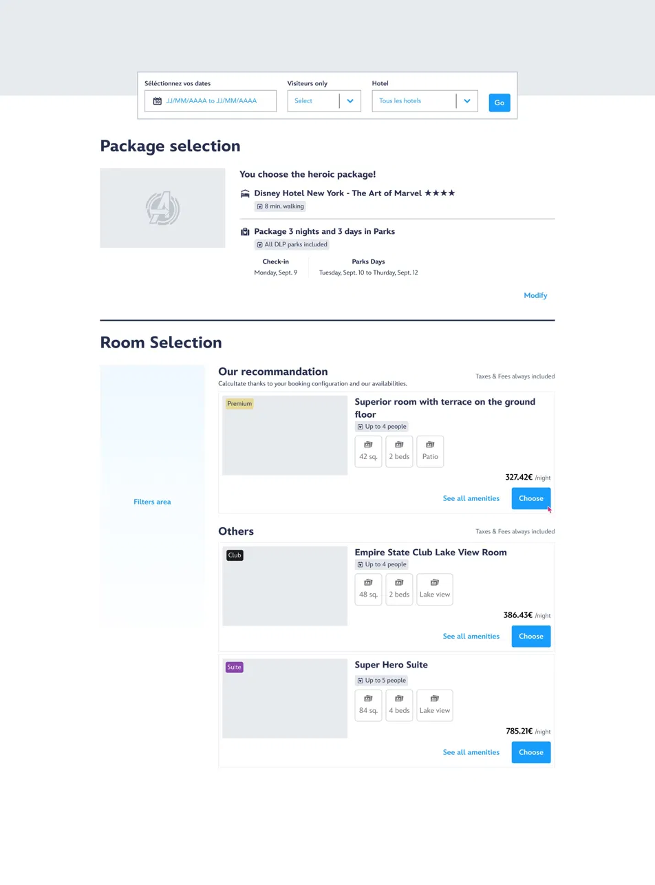
🔴 Users can't compare offers and hotels at the same time
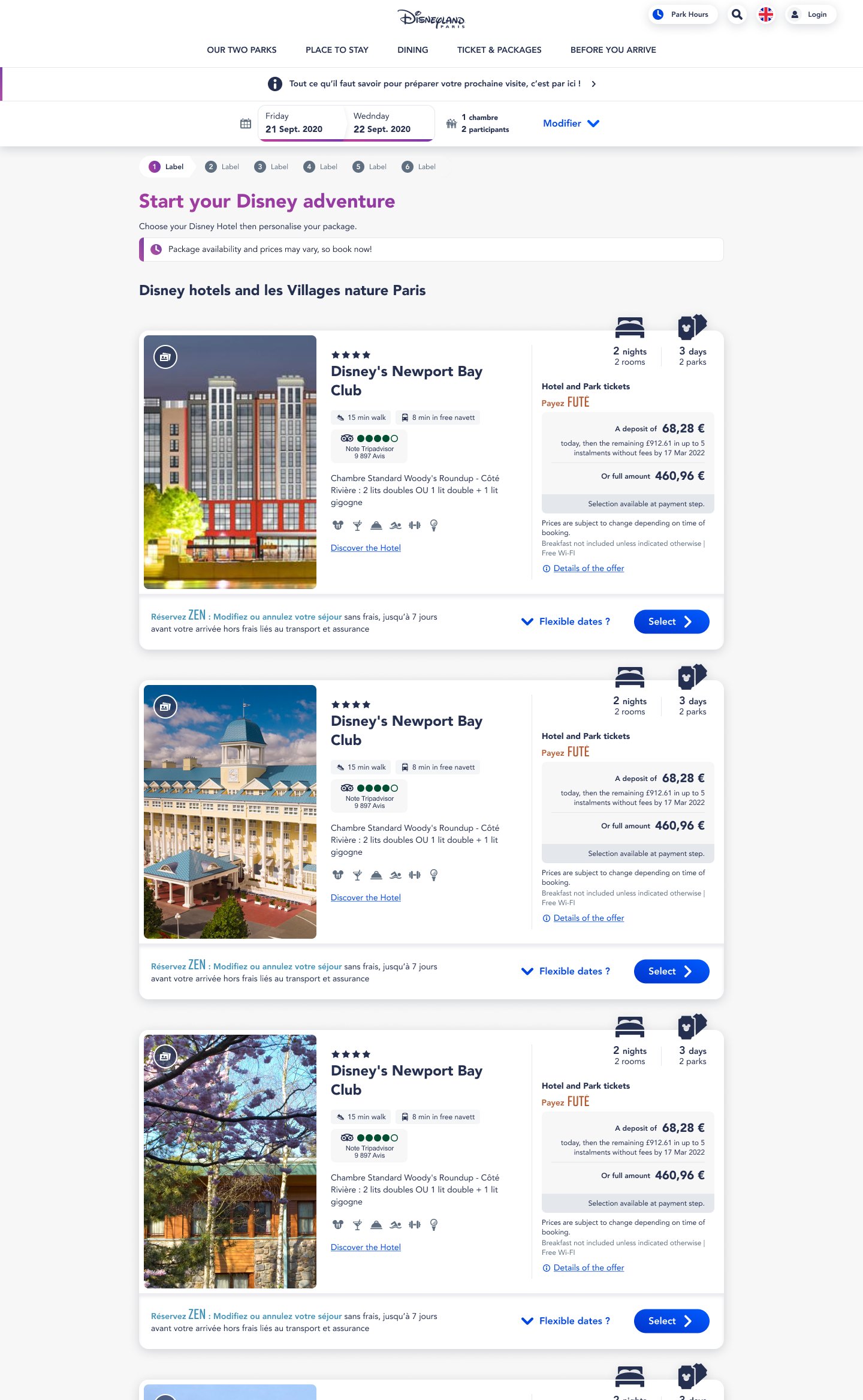
When the business wanted to push a commercial offer, the default fix was to add a page after hotel selection. Users would then discover an alternative that undermined a choice they'd already made, and the offers shown were limited to the hotel they'd picked.
🔴 Park Tickets included in the package weren't visible
That information wasn't presented as a core part of what they were buying. Net result: the package value for money was poorly understood.
🔴 The mobile experience wasn't fit for purpose
Hotel and room were two disconnected steps with no narrative continuity. A room was pre-assigned when users picked a hotel. Cards took up too much space, the cart wasn't visible, and users had no clear summary of their selections.
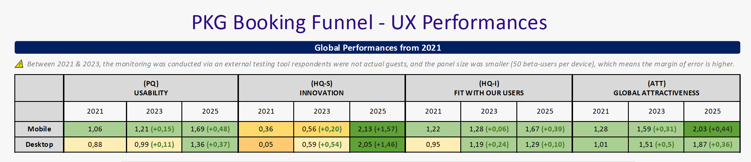
📊 Latest AttrakDiff data for the journey
Phase 1: Finding the optimal journey
We ran a series of collaborative workshops and a competitive benchmark.
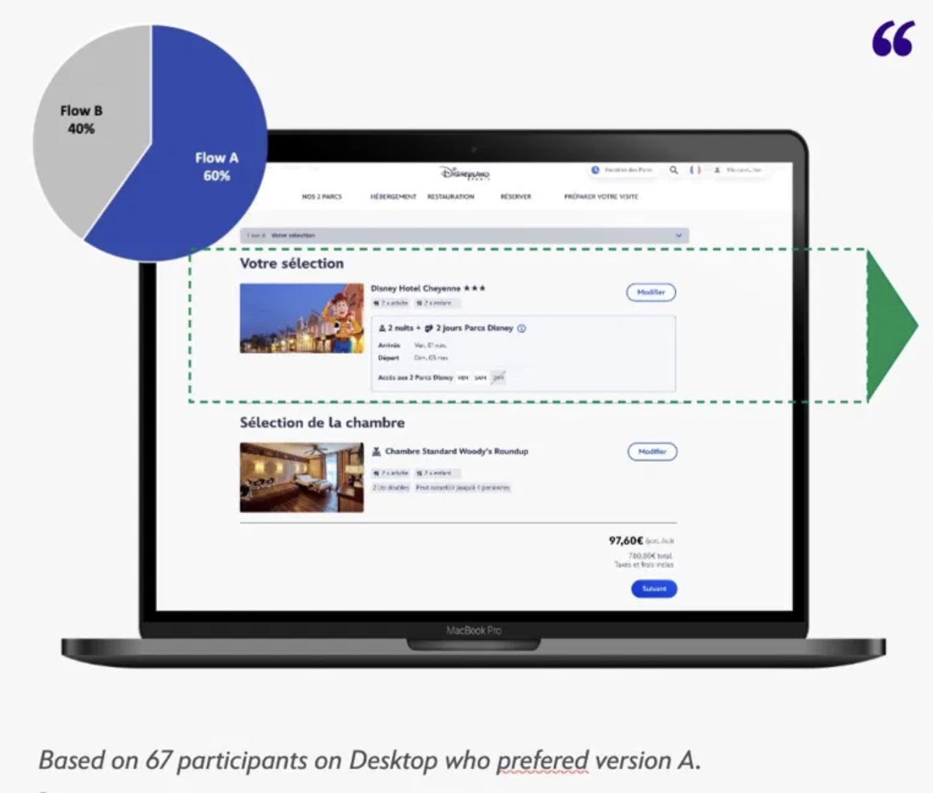
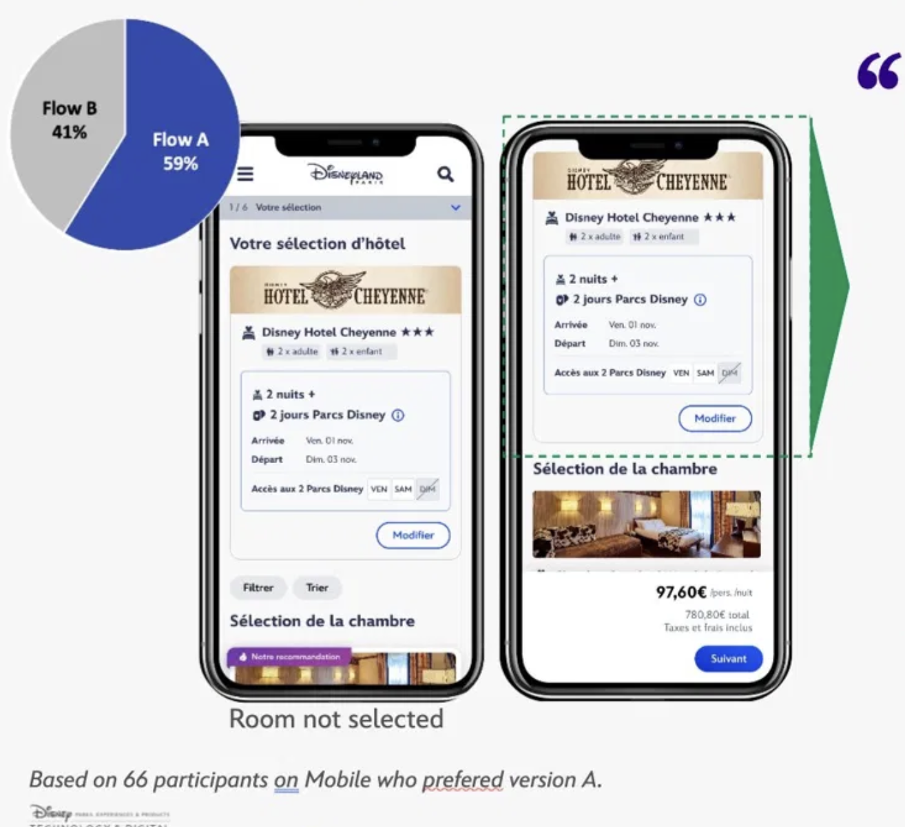
We put three journey types head-to-head in comparative testing: a sequential flow, a single-page centralized experience, and progressive disclosure.
Progressive step-by-step disclosure improved how users perceived the journey.
Users found the progressive disclosure journey better organized, clearer, and easier to process.
5 user tests run: 2 quantitative and 2 qualitative studies
572 beta users, with 556 respondents in quantitative studies and 16 in qualitative studies.
Four decisions that changed the funnel logic
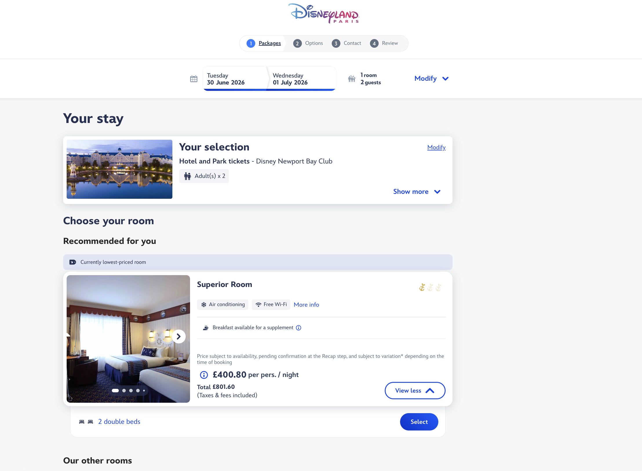
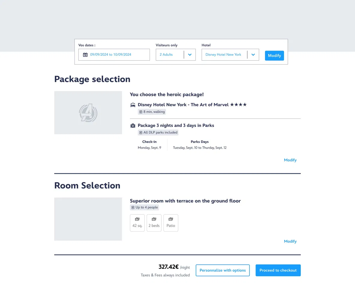
1. One page, two steps
Hotel and room selection sit on a single page, revealed progressively. Users build their package in two steps, confirm in one action, and move Extras to a separate step.
2. Tie hotels and offers together.
Each hotel now carries its own commercial offers. Hotel and ticket selection are linked from the start, which finally makes the Disneyland Paris "Hotel + Ticket" promise legible to users.
3. Remove the pre-selected room.
In the old funnel, each hotel had a pre-assigned room matching the displayed price. We removed that logic. Testing showed that dropping the "Included" label put all rooms on equal footing and reduced cognitive load.
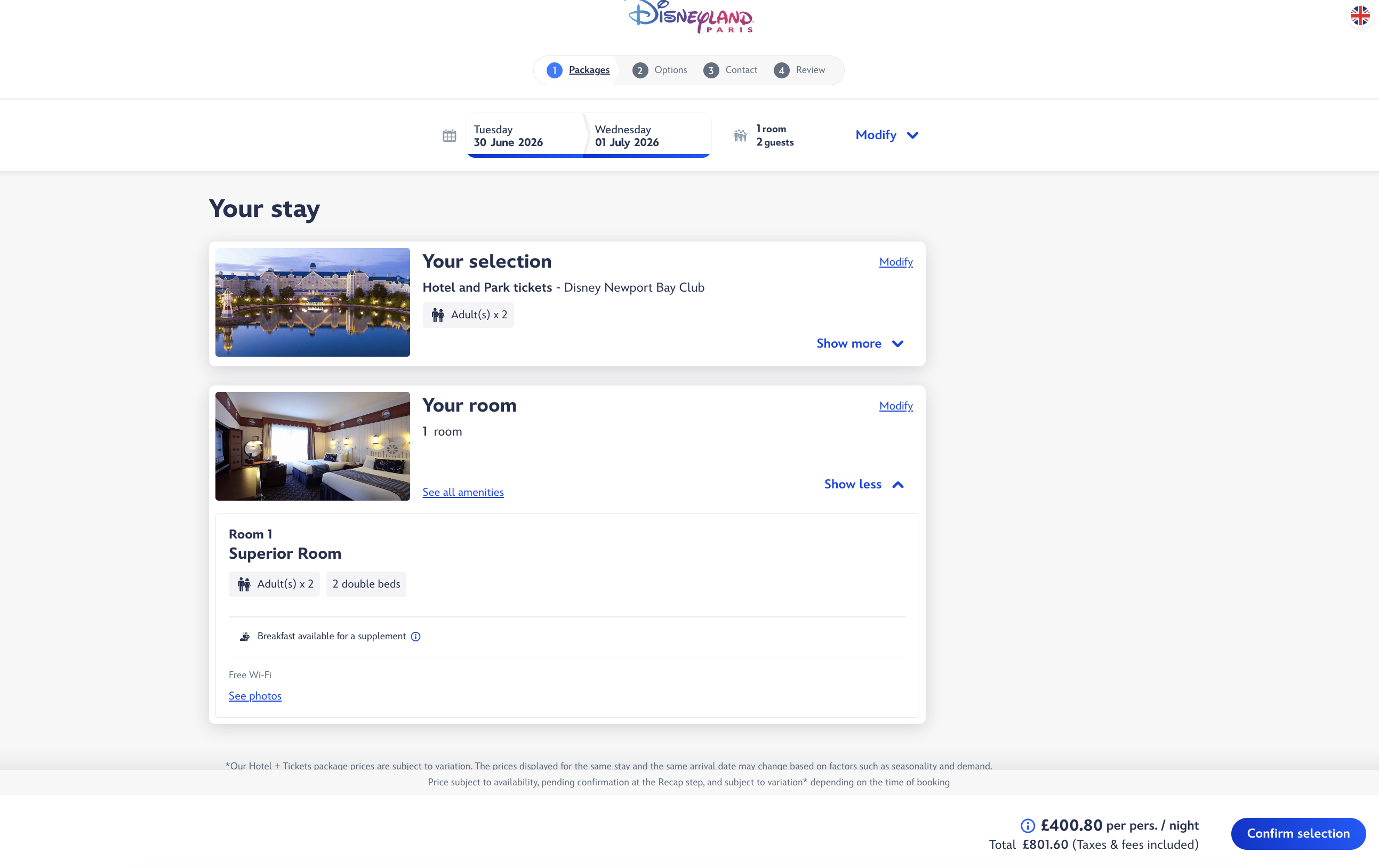
4. Build a Package Selection summary
A new screen summarizes the full package: nights, park days, selected room, and price. Everything is visible before adding to cart.
Evaluating the improvements
Phase 2 pit the new progressive disclosure journey against the live journey with 133 participants. The new flow was preferred by 59% on mobile and 60% on desktop.
"The second one feels clearer. It's reassuring to know the summary isn't hiding any nasty surprises. The first one makes you feel like you might miss something important, and that's unsettling. You're looking for the catch."
Beta-user, mobile
"You can see straight away that room booking and park tickets can be handled together."
Beta-user, desktop
"Both are well organized, but I found the first one faster and more practical to use."
Beta-user, desktop
Production
Live here: https://book.disneylandparis.com/en-gb/.